Let’s look at some maps today. Now, if you hated geography in school, you might be groaning, “I hate maps!” But if you loved geography (like I did) then you’re probably thinking, “I love maps! I can’t wait to see them!” First, I must thank by good friend Sr. Mary Fran Taymans for alerting me to these maps. Some of them are unusual. So let’s begin with map #1. Map #1 is a map of which countries use the metric system (gray) and which use the imperial system (red). 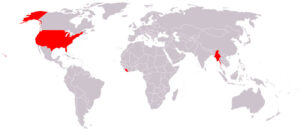 Any thoughts or feelings bout this? What do those of you living in the U.S. think? What about those of you not living in the U.S. Any thoughts you’d like to share?
Map #2 is a map of the world’s religions. ( reran this map toward the end of my blog so I could make it bigger.) Does anything surprise you here? What are you thinking or feeling as you gaze at this map?
Map #3 is a map of the planet’s vegetation. 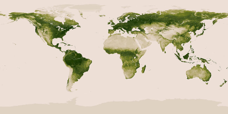 Find your spot on this map. How does it compare with other parts of the world? Does anything on this map surprise you? Alarm you?
Map #4 is a map of the risk of drought in the world (red = high risk, light yellow = low risk).  Those of us living in the US are very aware of the drought in some parts of our country–as evidenced by so many fires and the rise in prices for goods such as beef, celery, oranges, wheat products, etc. Notice that the risk of drought is not limited to places on or near the equator.
Map #5 is a map of the rivers in the U.S. 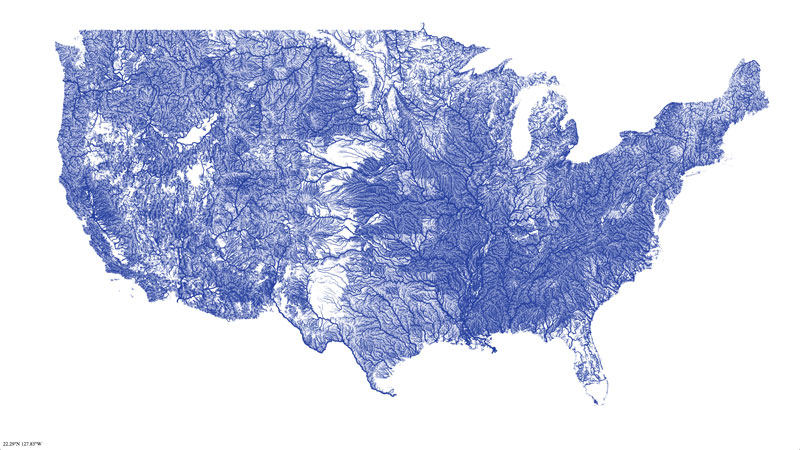 If you live in the US, how does this map make you feel? What are the names of some of the rivers near you? What impact did these rivers have on U.S. history? What impact are they having on contemporary times?
Map #6 shows us the world’s population split into equal sections of l billion people. In other words, each color represents 1 billion people. 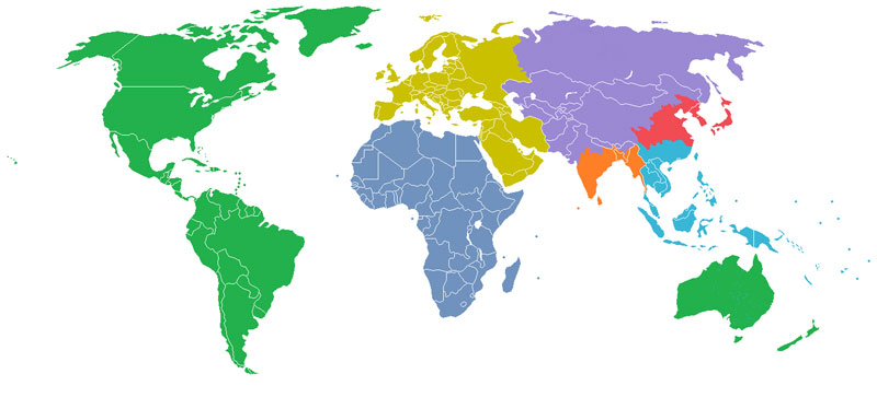 Any surprises here? What are your thoughts as you look at this map?
Map #7 shows the historic shift in the world’s economic center. 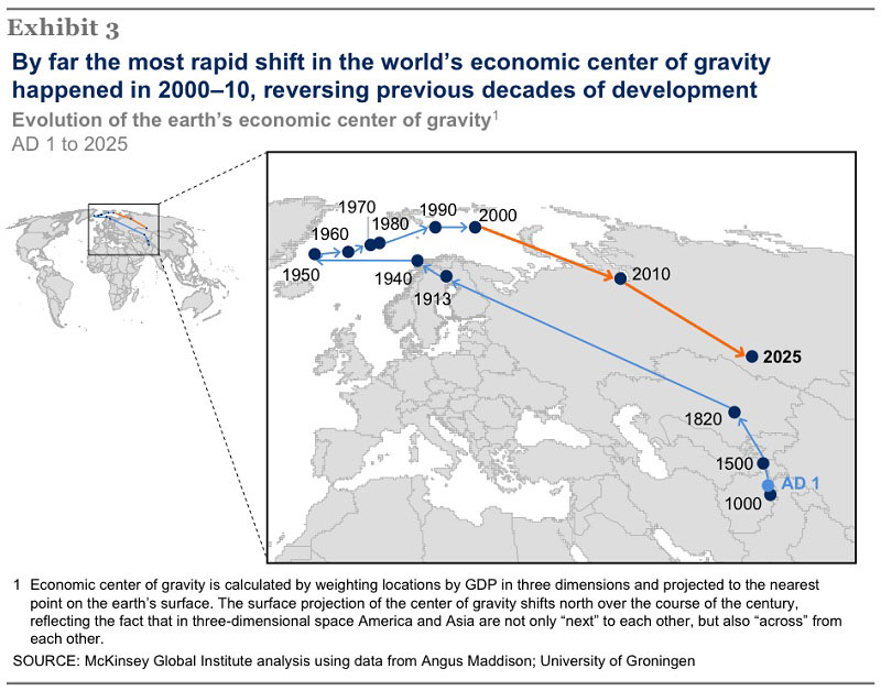 Do you see anything significant here?
Here’s the map of the religions of the world again. I hope it’s easier to read.
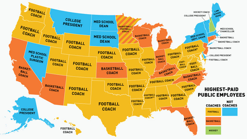
Map #8 shows the highest paid public employees in every state in the U.S. Any comments?
Map #9 is our last world map.
Do you notice anything unusual about it? 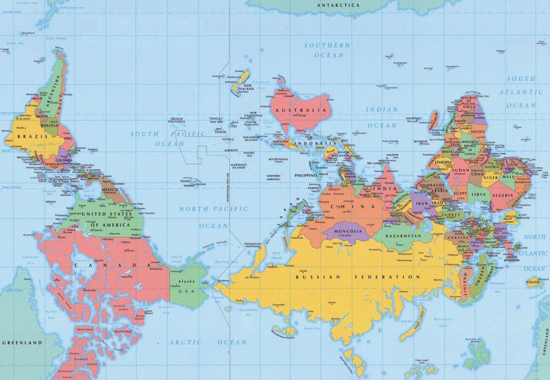 Some of you might be saying, “This map is upside down!” But what is up and down? Isn’t up simply the direction away from the center of the earth? What happens to up and down once we leave the earth? This map’s orientation is to the south–not to the north as we are accustomed to! Does looking at the world in this way do anything for you?
Those are our 9 maps for today. Does any map stand out for you? Did you learn anything from these maps? I would be interested in getting some feedback! Thank you! PS: I will be in Cullman, Alabama June 7-14 giving a day of recollection on June 7th followed by a week long retreat at the Benedictine Sisters Retreat Center there. Once again, I ask for your prayerful remembrance of these events. Thank you very much!




12 Responses
Sr. Melanie,
I found the map about the highest paid public employee interesting since I am a state worker teaching at a public university. It strikes me that some states would make the highest paid employee their coaches. It says something about what we value as a people.
Thanks for sharing the maps.
Kathleen
Dear Kathleen, You bring a unique perspective to that map of the highest paid public employees. The map certainly does say something about what WE value as Americans… (myself included)….Thanks for writing! Sr. Melannie
I too love maps! The sense that boundaries, after all, are just made by humans. The upside down map made the USA seem so small! And the US map showing rivers but not state boundaries got me thinking back to Lewis & Clark, which was kindof how the entire western US was back then. The map showing concentrations of 1 billion people was to me the most alarming. How much space we enjoy here and how cramped it must be in China, India and SE Asia! And I agree with the previous post on what it says about us as a country that coaches are the highest paid public employees.
Still, the thing I find most interesting about maps is that they express the level of human understanding as of a specific place and time. Maps improve as our understanding of peoples, rivers & mountains improves. Which has me thinking – Does our “map” of God improve as we seek to better understand His works?
Dear Karen, You call our attention to a good point to remember: boundaries are made by humans…And I loved your final question: “Does our ‘map’ of God improve as we seek to better understand his works?” Great question! You took us to another level! Thank you for your comments! Sr. Melannie
Hi sister
Your columns always get me thinking but this one elicited so many emotions. I was appalled, enlightened, worried and discouraged. But these map facts, as shocking as they are can also be motivational. There are many things we can do to improve some of these statistics such as being conscientious about our ecosystems; and remembering tolerance for all religions since God loves us all. However, I would like to see more Catholics on the map.
I try to spread the word about our wonderful religion as many of my friends have left the church. No easy task and naturally I don’t want to sound pushy. However, I find myself bringing up to friends and family whatever the homily was about that Sunday and so far nobody has been annoyed!
Great information!
Dear Anita, Wow! What you wrote really edified me! Your response to the maps seemed to involve a range of emotions. And I liked your words: “But these map facts, as shocking as they are, can also be motivational.” Good point! And one good way we spread the “Good News” of our faith is by living it in a joyful and generous manner. I suspect you are the kind of person that does that….Good hearing from you! Sr. Melannie
I. too. am a map nut. I love to follow an atlas as
I ride with someone traveling.
In 1980 I finished my Master’s thesis on
junior high kids teaching adults (their parents)
the metric system since the USA was to change
over in 1982. HA! The almighty dollar got in the
way–too expensive for businesses to change
over, text books didn’t change, because teachers
wouldn’t change because textbooks wouldn’t change
because. . .
Other ones lots of rich info–Thanks!
Dear Mary James, Glad to meet another “map nut.” Like you, if I’m traveling I always love looking at the map. When I give a talk or retreat somewhere, I go on line and pull up a map of the area. I like to know where I am and what’s located nearby. I found your comment about teaching kids in 1980 how to teach their parents the metric system quite interesting! Thanks for sharing your experiences with us! Melannie
These maps are fascinating. Thanks for sharing them.
I, too, wish there were more Catholics. We need to pray, to bring more back. From looking at all the maps, it appears South America is in pretty good shape ?!? I did not like the Football one. It gives me a bad taste in my mouth. I’m concerned about us all drying up and food prices rising.
You have such interesting subjects. Keep up the good works.
Dear Sue, I’m glad you found the maps “fascinating.” I know I did too, so that’s why I shared them with you. There are several concerns we probably have after viewing these maps. Thank you for sharing some of yours! Sr. Melannie
We have (and probably don’t appreciate) an abundunce of space, food, water compared to the rest of the world. We have an absence of what is important – sports coaches, really? I couldn’t make out the “faith” map – the print was too small – but I suspect we don’t have many believers/practicers of any faith. Which is why our “values” are skewed.
Dear Jean, Yes, many of us living in the US, do have an abundance of space, food, and water compared to many places in the world. I know the first time I saw the map of all the rivers in the US, I said aloud, “How beautiful!!” And then, “How lucky we are!” When I drive to places, I try to be more aware of all the creeks and rivers I pass over on my way to my destination…as a way to become more appreciative of their presence in our lives…I reran the world map of religions toward the end of the post, so I could make it a little bigger. Thanks for letting me know it was too small to read. Thank you for writing! Dolly